Today, I have some thoughts about about slow fashion and color trends.
Slow fashion is all about buying or creating better quality clothing that wears well and lasts longer. Contrast that with fast fashion that is cheaply made, frequently bargain-basement-priced, and worn only a few times before being discarded or donated.
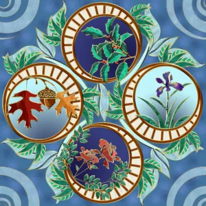
My fabric designs are all about slow fashion. I want them to be fun so you can enjoy wearing and using the resulting creations for a very long time. I also want the fabric they’re printed on to be quality fabric that will wear well.

These blue hues are timeless and will always be in style as long as people wear blue jeans.
One of the reasons why Art Nouveau is so timeless is because of the gorgeous color palette.
This is a huge part of why I’ve been publishing my designs on Raspberry Creek Fabrics: because of their quality fabric selections from American sources.
Slow Fashion and Timeless Color Trends
To that end, I’m also always looking for colors that have a more timeless appeal that everyone can enjoy (not just me). I love color…
Fast fashion is all about the latest color trends and palettes, but–they don’t always feature the nicest color selections. Some of the more recent colors have been pretty harsh or garish, or had an unfortunate tint. Many times, my attempts to coordinate with these colors leave me scratching my head in dismay. What were people thinking when they chose these colors ? How are we supposed to coordinate these colors?

Pantone color palettes are ALL ABOUT fast fashion. Every year, they come out with two sets of color palettes: one for spring/summer, and one for fall/winter. This 2023 fall/winter color palette seems rather confused. Were the colors picked for two very different reasons? One set is so bright that it’s almost garish, with colors that would play well in Florida at the beach or in Arizona on a golf course. The other set is very neutral and subdued. Many of these colors don’t coordinate well at all. There are no colors here that tie the whole palette together.
Some of them are still pretty nice, though. I do like that “kohlrabi” green and that “Persian jewel” purple… And while I like to draw inspiration from the current year’s color palettes for Pantone and HGTV when I can, I also go looking for other colors that coordinate well with those palettes and I like to come up with my own palettes.

This Boho collection features a soft timeless color palette.